An unsolicited redesign project – redefining how mobile website users of South Dublin Libraries reserve their favourite books and bring the library back to the community
| Client: South Dublin Libraries (Unsolicited redesign project) |
| Sector: Education, Community |
| My role: Analyse and elevate the title reservation system design on the mobile website – from research to conception, visualisation and testing – and bring it back to the community |
The rise and fall of the library in the community
Once upon a time in Ireland, libraries were at the centre of the community. They were places filled with stories, ideas and knowledge collected over generations. Libraries were found all across the country, from small towns to the heart of cities like Dublin. But as the world changed, so did people’s habits.
In the age of Amazon and online bookshops, where a few clicks could have a book delivered to your doorstep, traditional libraries began to fade quietly into the background. Fewer people walked through their doors and fewer still opened the pages of old fashioned paper books. The internet and digital media, phones and tablets had taken over, leaving the shelves of many libraries gathering dust.
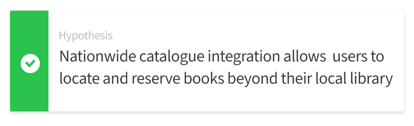
A change is needed to the website to breathe life back into the way people connect to the library system Through it, anyone needs to, with minimal effort, search for books and other materials and reserve them from libraries across South Dublin and beyond. The website should help users find what they want quickly, reserve them without frustration, and stay informed every step of the way. In 2025, technology should not be used to replace the magic of books but help people find their way back to them.
My first impressions
My first step was a design review of the current mobile site. I spent some time looking at the website and put myself in the user’s shoes. First I wanted to see what worked well and was of benefit to the user. Then I looked at what could improve to help them achieve their goals and made some assumptions. It’s not always about re-writing the story, just a few paragraphs here and there can make all the difference.
| What works | What could be improved |
My research plan
To understand the issues with the library reservation process and confirm my hypotheses, I conducted several types of research. User interviews to build up a picture of the current library user and get qualitative data. I also asked them for feedback on the website using a questionnaire. A user survey was conducted to get a picture of the perception of the library and its usage by non-users. I explored the reservation user journey to identify any pain points and added to this by conducting usability tests. I also tested iterations of new designs using A/B tests to validate the design success.
Who uses the library?
I want to understand who currently uses the library. Who they are? What are their wants and needs when they visit their local library? How can we make their experience a more positive one and rewarding one? By doing this I can prove my hypotheses?
Getting to know the library users
— Parents of young children |
28–50 years old | male & female
— Teenagers – university students |
13–24 years old | male & female
— A higher proportion from lower income families
Talking to the users
I wanted to get insight and opinions from some current users of the library. I went to my local library branch and found some people who were happy to talk to me about it. I ended up doing 5 interviews and got to understand what influenced their decisions to use the library service.
In summary, 3 out of 5 said it was due to the catalogue of books available and having many convenient locations in the area meant easy accessibility. The remaining 2 said it was a free service which attracted them and they were happy to use the service in place of regularly buying books and other materials.
Quantitative study
I wanted to quantify the feedback on the current website’s design. At the end of my user interviews I’ve asked the attendees to assess the existing design of the website by completing a questionnaire that uses System Usability Scale (SUS).
SUS score
I’ve calculated the score using SUS calculator in Excel I’ve created using relevant formulas: 77 0ut 0f 100.
Who else could be a user?
I was now starting to build a good picture of a typical library user, but I needed more information. I wanted to further understand why someone who is not a current user may use the library and what would be important aspect for them in a library website. This would help prove my hypotheses.
For this I decided to do a survey to reach a wider number of people with the most common uses of the library facilities from my research and my own observations. I ran a single-answer survey among 20 representatives of the target audience using Google Forms see what they would use their local library website for most frequently.

55.1% – reserving a book or title, 15.6% – researching new books and other material, 10.3% – accessing children’s resources, 10.2% – accessing other other online resources, 8.8% – Other


The user journey – walking in their shoes
Next I wanted to understand how many steps it takes for users to complete a reservation. This may show if the user journey could it could be improved or simplified. If it’s too long, takes too many steps or make users jump through too many needless hoops then they may drop out before completing the reservation process and you lose their trust.
Current reservation journey
I’ve mapped using figjam a detailed flow of reservation of a book or other title.
Validating my design assumptions
Moving on in my journey, I did some usability testing to validate all of my design assumptions from the design review. I had identified some issues with the site to improve upon but needed validation from a third party to make sure I didn’t overlook anything.
Reservation process walkthough
To achieve this I set up as face-to-face usability test. I chose a sample library user from the target audience and asked them to complete a set of tasks on the mobile website. I used Loom app for this as it was easy to install, set up and connect to my laptop to observe the person. I received some narrated video that provided lots of insights to test my hypotheses.
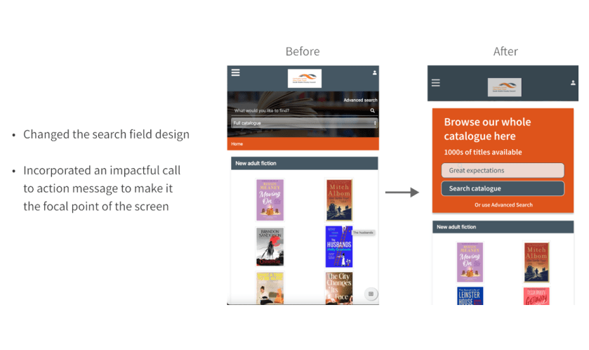
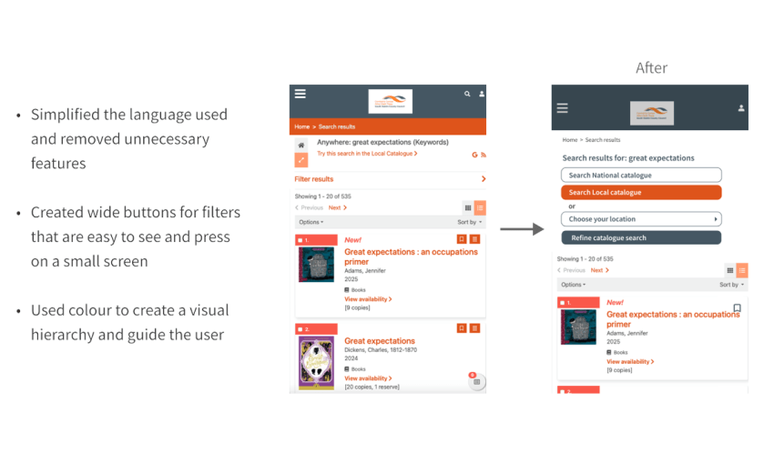
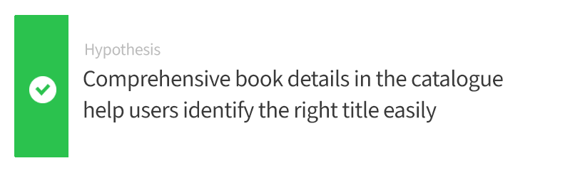
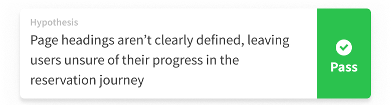
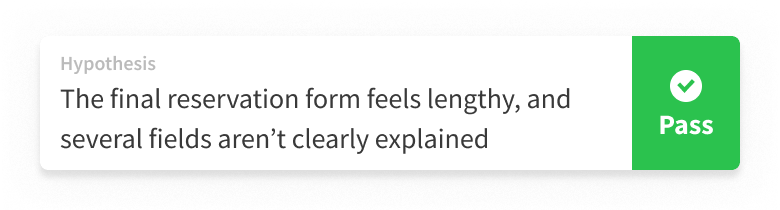
Based on what I learned, I proposed to simplify the reservation form to encourage users to complete the reservation process, improve the visual impact of search field on home page, add easier filters on catalogue search around location and catalogue search and make heading of pages and call to actions clearer

Did I get it wrong?
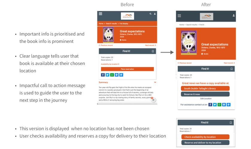
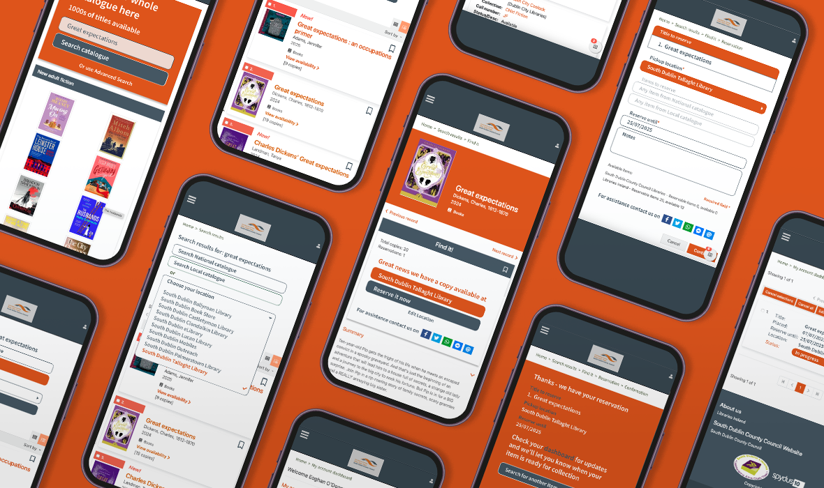
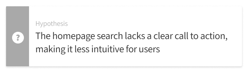
Now I had to take all the information I gathered from the research and start putting some flesh on the bones of my hypotheses. I believed that making the search screens clearer, with an emphasis on a location was most important. This would be key to helping users find a title they wanted and knowing if it was available locally. This would encourage them to reserve it and collect it from the library. If not the book would have to be sourced in a different location and there was no assurance of when it would be available. Did I get it wrong?
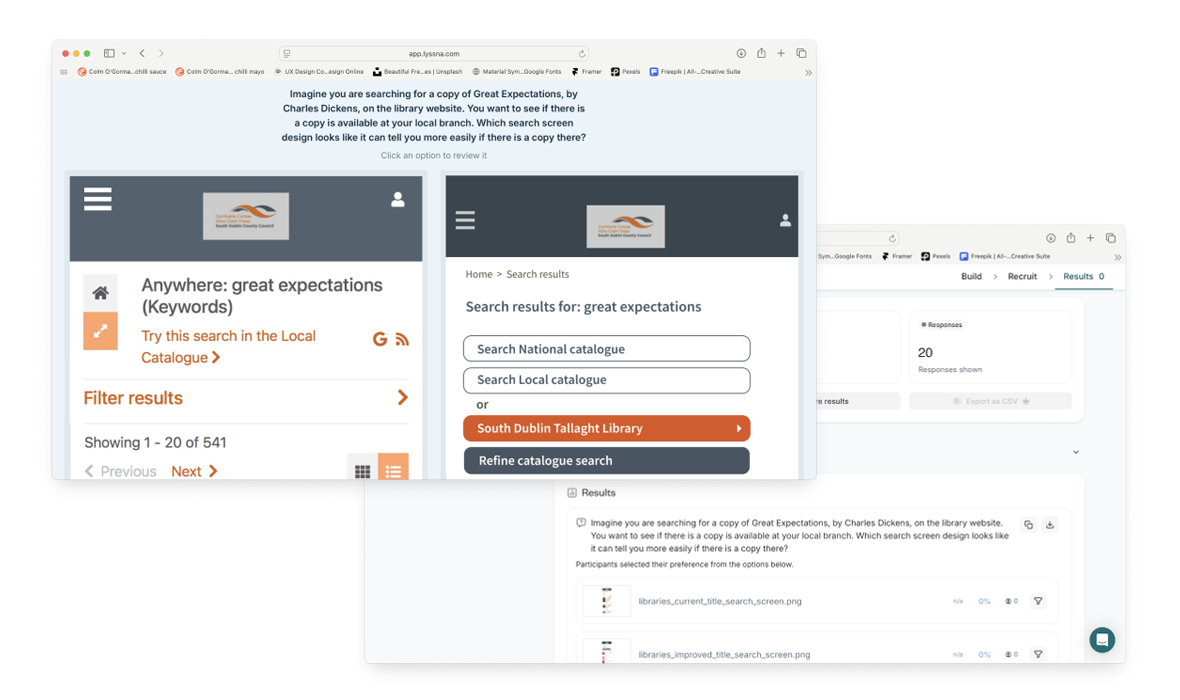
Search screen comparison test
To find out I decided to test how the current design and a proposed design for the search page on mobile tested against each other with users. I set up an a/b test on both search page designs using Lyssna.com with each variants side-by-side.
Variant 2 has a 60% probability to be the best based on the number of preferences during the test. Comments stated that variant 1 has lots of filters but none of it seems to give that option, it also looks confusing and messy. Variant 2 is much clearer and interactive, you know what you can do easily and less common search functions aren’t getting in the way.
My hypothesis was proved correct so I got it right here!
Redesigning the website
I finally had a road map and a vision to go with it and now it came to my favourite part – taking all that research, analysis and testing insight and putting it to work in the re-design process.
What was in scope were aspects of the key pages throughout the reservation journey, where important steps or info wasn’t easily aparent or didn’t help the user to complete the booking.
I started off by doing some simple wireframes. I looked at information displayed on the current pages and played around what was important to the user and what wasn’t necessarily helpful before moving to a high fidelity prototype.
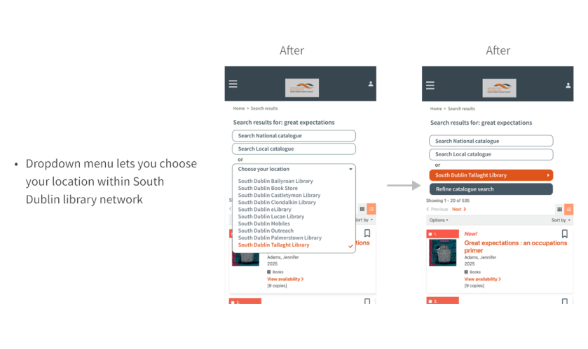
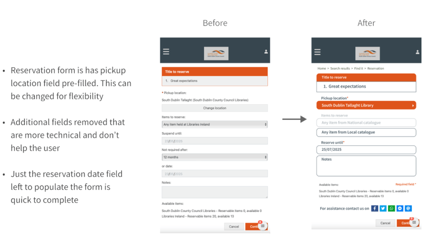
I focused on communicating progress, making search filters clearer and user choices easier. I brought the location search functionality front and centre, reducing the visual noise and removing some work from the reservation form.
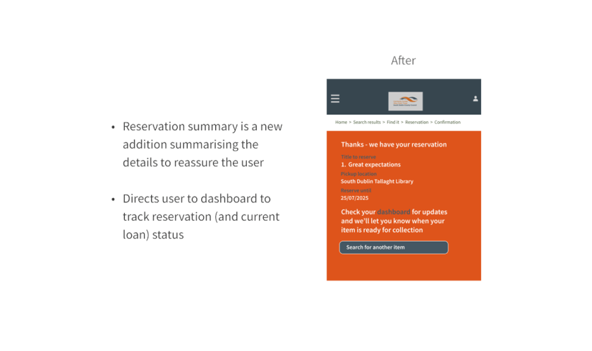
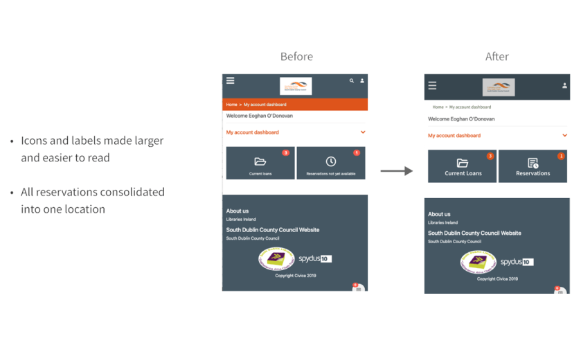
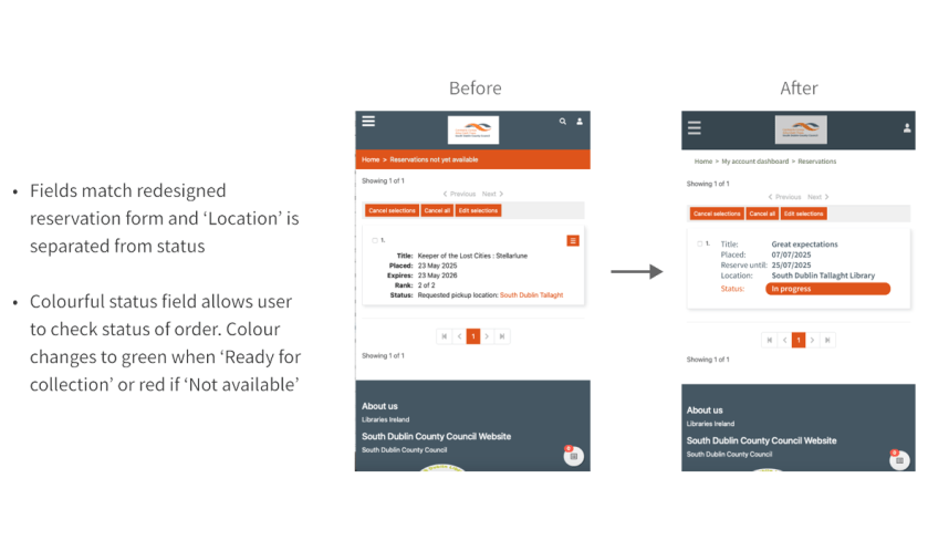
Also I found the dashboard quite clunky and unintuitive so I made it easier by adding the status to each record in place of having multiple folders and lists that appeared and disappeared.
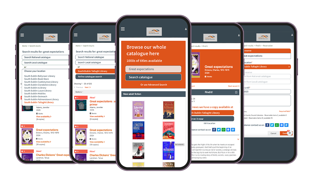
See my prototype in action or watch the video below
You can see a screen by screen breakdown of the changes and the benefits of my re-designed and improved app below compared to the current design.