An unsolicited redesign project – redesigning the mobile website for London care hire company, Miles & Miles to launch their new luxury car hire delivery service

| Client: Miles & Miles car rental company (Unsolicited redesign project) |
| Sector: Automotive, luxury car hire |
| My role: Analyse the feasibility of a London based luxury car hire delivery service. Redesign the reservation system design on the mobile website – from research to conception, visualisation and testing – and bring the luxury to life. |
Miles & Miles are bringing the luxury
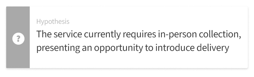
As part of my UX School of Design, London bootcamp, I worked on a personal project for Miles & Miles, a well-established luxury car hire company based in London. The company wanted to introduce a new premium service that enables customers to have their chosen luxury vehicles delivered directly to their door and later collected from the same location anywhere in London, inside A25. No more trips to the company’s locations, just seamless, on-demand access to luxury on wheels.
I began by immersing myself in the world of Miles & Miles’ target customer base – young, affluent Londoners. They may not own a car but value convenience, exclusivity and status. They might need a luxury vehicle for a weekend escape, a business event, or a special occasion and they expect the process to be fast, effortless and well designed.
I made the decision to focus entirely on the mobile experience as for these customers as their smartphones are the primary connection to any service. The goal was to design a booking journey that felt intuitive and sophisticated, combining clarity of information, effortless onboarding and an aesthetic that should reflect the brand’s premium identity.
My first impressions
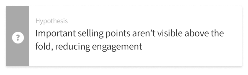
My first step was a design review of the current mobile site. I spent some time looking at the website and put myself in the user’s shoes. First I wanted to see what worked well and was of benefit to the user. Then I looked at what would need to change to incorporate the customer delivery aspect and where this would fit into the booking journey. Speeding up the journey was important as booking a hire car tends to be one of the longer journeys due to the amount of info required and sums of money involved.
| What works | What could be improved |
My research plan
To understand the issues with the car reservation process and confirm my hypotheses, I conducted several types of research. User interviews to build up a picture of the current customer and get qualitative data. I also asked them for feedback on the website using a questionnaire. A user survey was conducted to get a picture of the perception of the service and its potential usage by non-customers. I explored the reservation user journey to identify any pain points and added to this by conducting usability tests. I also tested iterations of new designs using A/B tests to validate the design success.
Who wants this?
I want to understand who currently rents luxury cars. Who they are? What are their wants and needs when they open the app? How can we make their experience a more positive one and rewarding one? By doing this I can prove my hypotheses.
Who are the potential customers?
— Wealthy young people | 27–40 years old |
male & female
— University educated | young professionals | live within A25 area
— Has lots of disposable income and values
status quite highly
What do you do when you have no-one to interview?
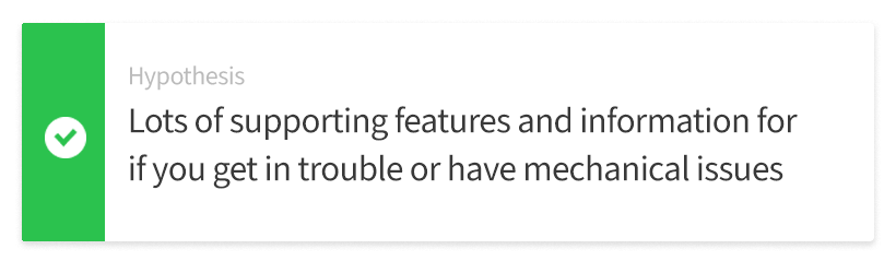
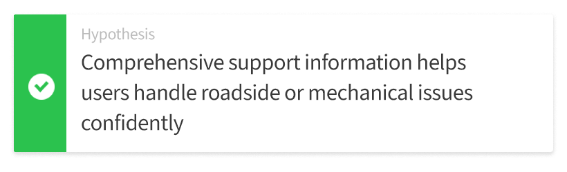
I wanted to get insight and opinions from some potential users of the new delivery service Miles & Miles were launching. As this was a bootcamp project and specialist project, I didn’t have access to interviewees but using material provided and through a Q&A session I was able to build up a profile of potential users to understand what would influence their decisions to use the luxury car hire delivery service. The main factors were – range of attractive cars, availability of different models, easy and quick booking process, key information is clear so as not to slow the booking process down things down.
Quantitative study
I still wanted to try and quantify the feedback on the current website’s design so I asked the tutors to assess the existing design of the website by completing a questionnaire that uses System Usability Scale (SUS).
SUS score
I’ve calculated the score using SUS calculator in Excel I’ve created using relevant formulas: 78 0ut 0f 100.
Is there a wider demand for this service?
Beyond what info I had received I needed to further understand what the appetite was for a luxury care hire service for people living within A25. This would help prove my hypotheses.
For this I decided to do a survey to reach a wider number of people to see if they would value having a luxury car delivered to their location? Importantly would they pay a bit more for the convenience of the service? I ran a single-answer survey among 20 representatives of the target audience using Google Forms see if they would pay a higher price for the added convenience of having a luxury hire car delivered to their location.
56.7% – said yes, 27.4% – said no, 15.9% – said they weren’t sure

The user journey – how many miles and miles does it take
The information I was given about the potential customers was that the journey had to be optimised for mobile and be smooth and quick to complete. The profile of the customers stated that they were time poor and valued efficiency and convenience over cost. The user journey needed to be tight, clear and logical and not leave the customer stuck if something went wrong in the booking process. If it take too long, takes too many steps or make users jump through too many needless hoops then they may drop out before completing the task and you lose their trust and business.
Hire care delivery booking journey
I’ve mapped using figjam a detailed flow of the car hire journey with delivery to your location. This includes the essential steps, additional and luxury extras to upsell the service and add to the luxury, exclusive feeling of the service.

Validating my design assumptions
Moving on in my journey, I did some usability testing to validate all of my design assumptions from the design review. I had identified some issues with the site to improve upon but needed validation from a third party to make sure I didn’t overlook anything.
Find and book a luxury car under the current process
To achieve this I set up as face-to-face usability test. I chose a sample app user from the target audience and asked them to complete a set of tasks on the mobile website. I used Loom app for this as it was easy to install, set up and connect to my laptop to observe the person. I received some narrated video that provided lots of insights to test my hypotheses.
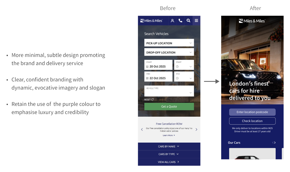
Based on what I learned, I proposed to simplify the home page emphasising the delivery service, the cars available and the prestige of the company. I will also simplify the rest of reservation journey and make the product look more premium and luxurious to attract new customers.


Was I travelling in the right direction?
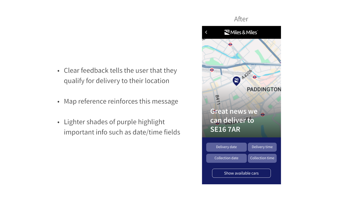
Now I had to take all the information I gathered from the research and start putting some flesh on the bones of my hypotheses. I believed that making the home screen look more purposeful with a single message and less like a condensed version of a website trying to several things at once would help deliver the message of service and also create an impression of luxury. This would draw the customer in and they could immediately check if they were in the service area and have car availability on the dates they wanted it for without too much effort. Was I on travelling in the right direction?
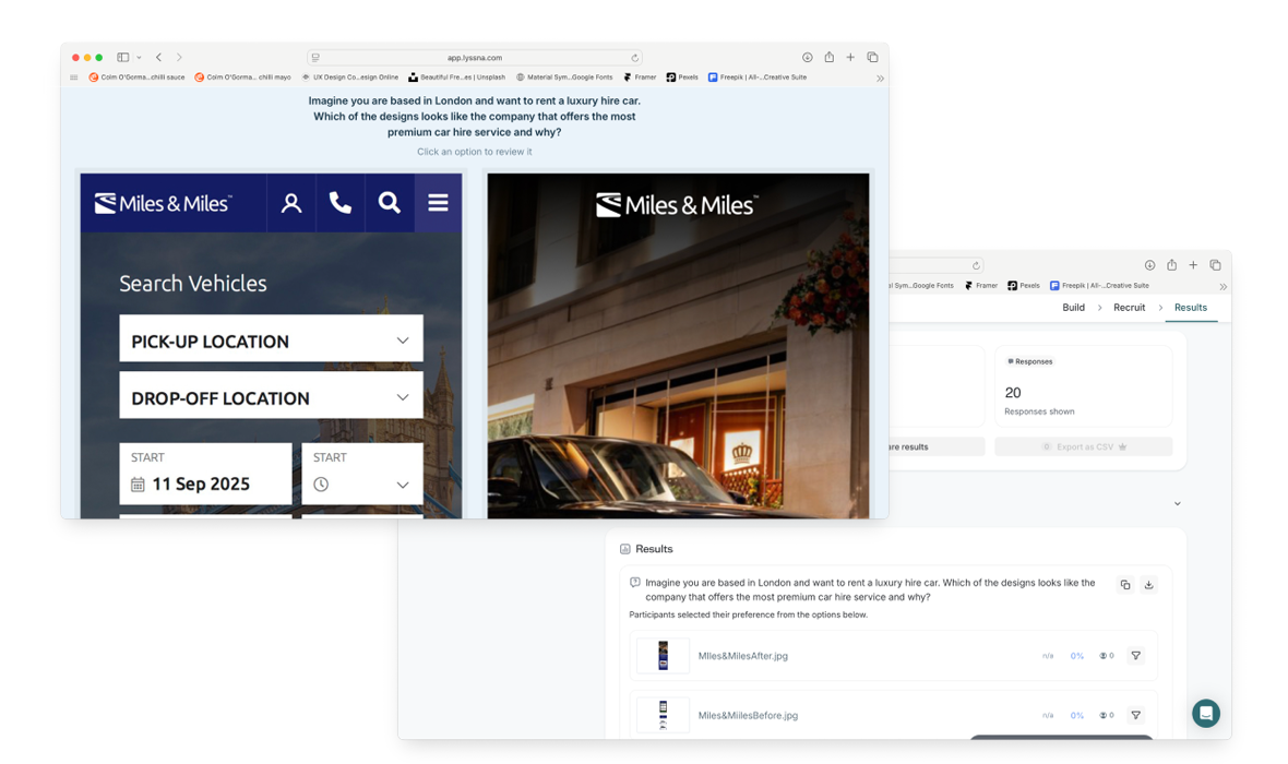
Home screen comparison test
To find out I decided to test how the current design and a proposed design for the home screen on mobile tested against each other with users. I set up an a/b test on both search page designs using Lyssna.com with each variant side-by-side.
Variant 1 has a 76% probability to be the best based on the number of preferences during the test. Comments stated that the slogan told them what the service was, the image of the Range Rover made it look like a desirable car
My hypothesis was proved correct so I knew I was travelling in the right direction.
Redesigning the website
I finally had a road map and a vision to go with it and now it came to my favourite part – taking all that research, analysis and testing insight and putting it to work in the re-design process.
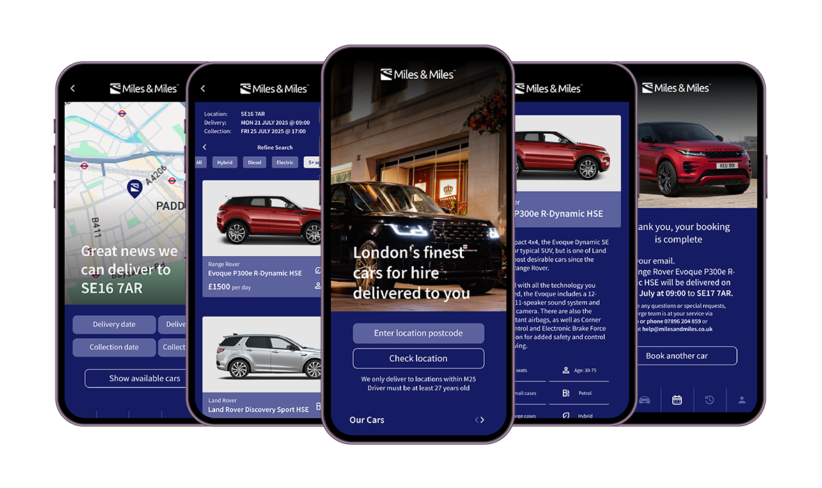
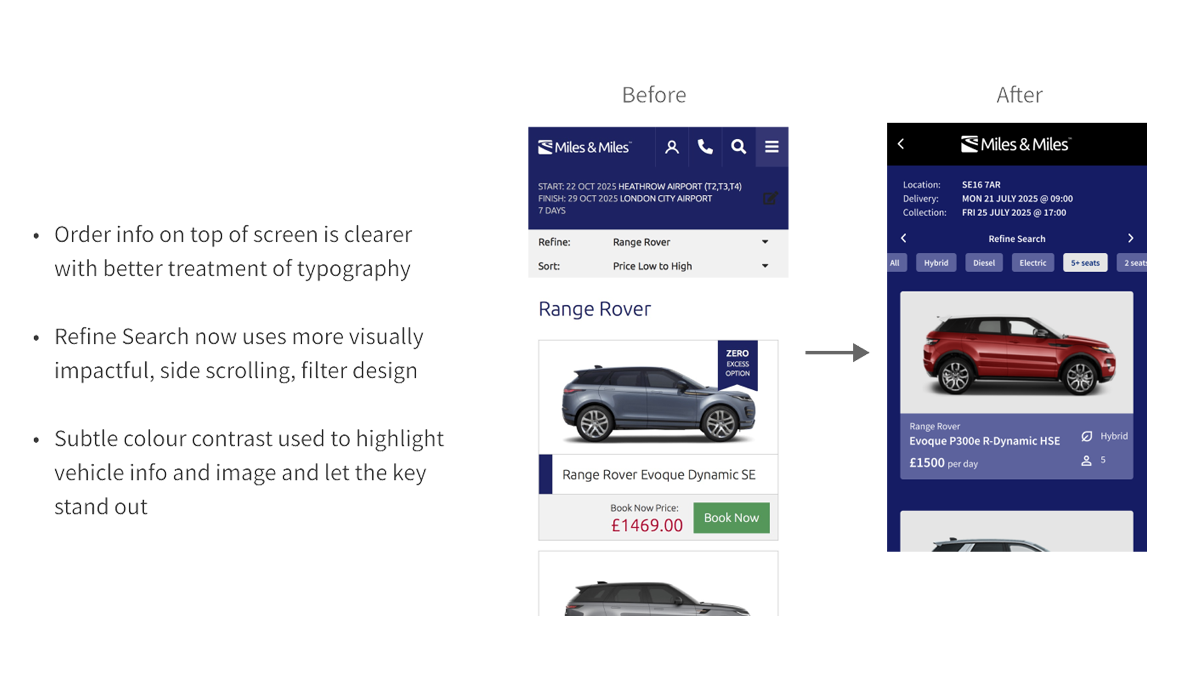
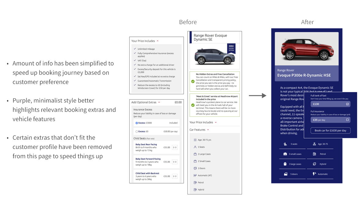
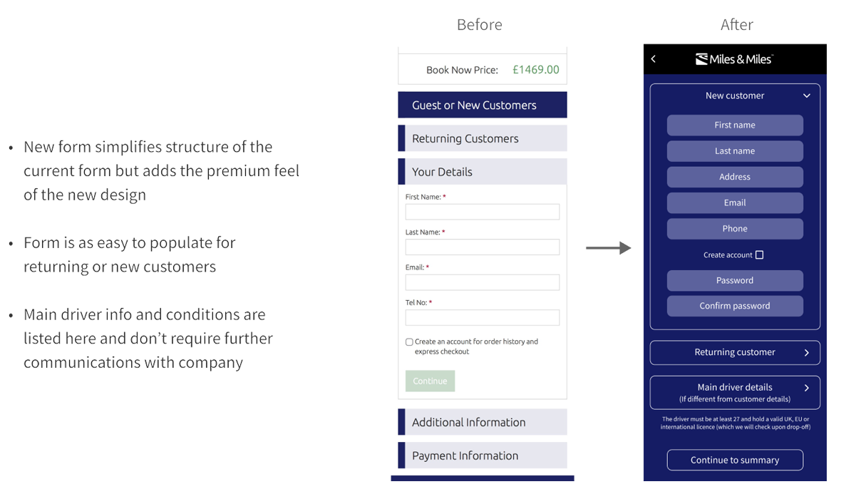
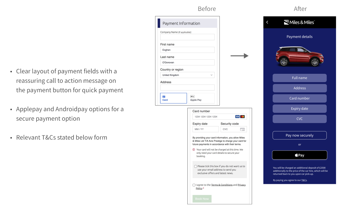
The design of the of the booking flow for the delivery service was the focus of my efforts. My reviews had determined that the website worked well in its current state but needed to be refocused to prioritise the delivery aspect and to highlight the premium, luxury aspect of the brand. Style was to be made an equal to substance.
I started off by doing some simple wireframes. I looked at information displayed on the current pages and played around what was important to the user and what wasn’t necessarily helpful before moving to a high fidelity prototype.
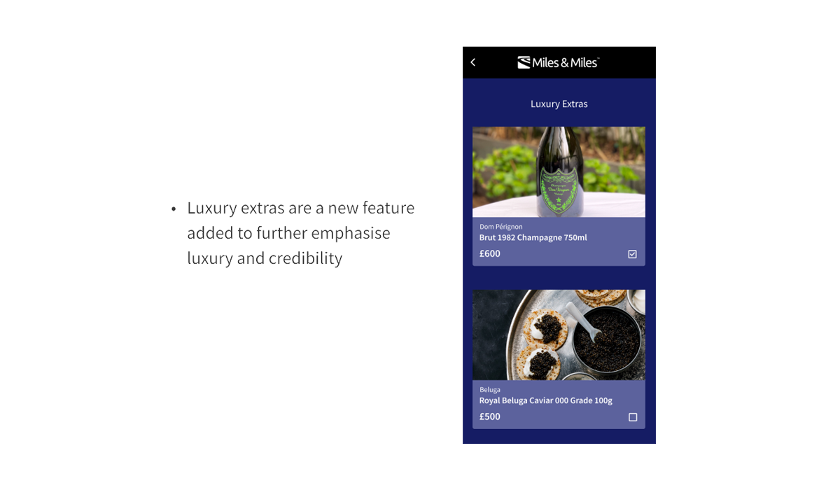
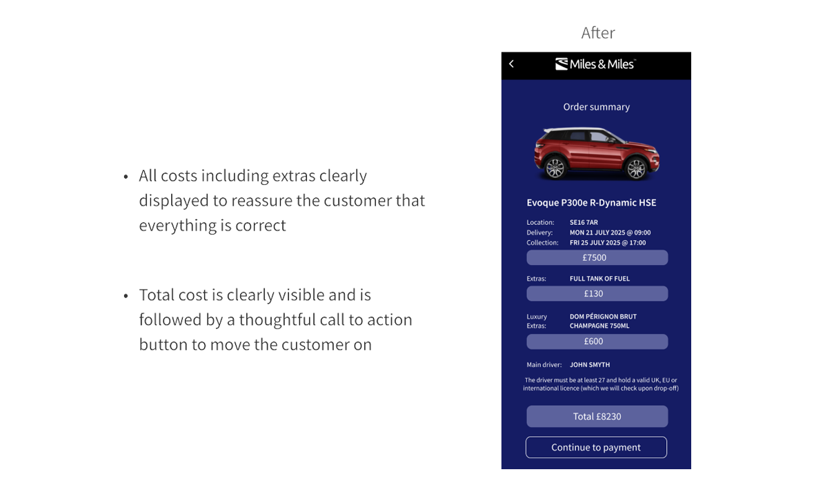
I focused on minimising the information on the home screen and tweaking the violet/purple colour to make it more prominent with its association to luxury and wealth. I also introduced more sublty in the design such as outlines on the buttons instead of a contrasting solid colour. This would make the website stand out amongst the more conservative, muted tones of competitors. I carried this through the other screens on the booking journey and making the imagery impactful and relevant for the customer whenever it was required.
See my prototype in action or watch the video below.
You can see a screen by screen breakdown of the changes and the benefits of my re-designed and improved app below compared to the current design.