An unsolicited redesign project -redefining how users of Find Me Gluten Free app research and find safe and tasty places to eat and keep it top of the App Store
| Client: Find Me Gluten Free (Unsolicited redesign project) |
| Sector: food and beverage, hospitality, gluten free & coeliac |
| My role: Do a full design review of the app, emphasise what makes it the best on the App Store and look for opportunities to further enhance and improve the app – from research to conception, visualisation and testing – and keep it top of the charts. |
How do you make the best, better?
Three years ago, when my son had to change to a gluten free diet, eating out as a family suddenly became a tiring puzzle full of hidden traps. Wheat flour, bread crumbs, soy sauce, cross-contamination – the simplest meal could be a minefield. After some research I eventually found an app called Find Me Gluten Free.
It wasn’t just another food app – it was the gluten-free restaurant finder, topping the App Store charts and boasting the most detailed database of gluten-free dining options in the country. Whether we were in Dublin city centre, or small Irish town with only one café, it always seemed to have something to offer. This was thanks to the engaged community who suggested and reviewed restaurants, bakeries, and the life-saver pub with a gluten-free burger and chips option.
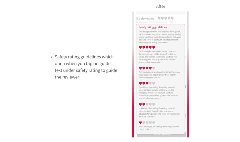
The strength of the app was this community with thousands of users sharing their reviews and tips. We learned what dishes were safe, which kitchens understood cross-contamination, where to find the best gluten-free desserts that made my some smile. It has a dedicated Safety Rating which isn’t just about taste or service; it was about reassurance for coeliacs and the highly sensitive.
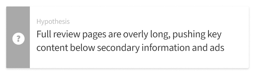
When it came to the app, the content was top of the charts, but the experience doesn’t match it. The app has excellent features and great quality content but the design lacks the rhythm and guidance to made navigation truly intuitive. The visual design and the hierarchy of information could be improved and it could do more to guide users through the main activities of searching for and reviewing restaurants.
My first impressions
My first step was a design review of the current app. I spent some time looking at the app and put myself in the user’s gluten free shoes. First I wanted to see what worked well and was of benefit to the user. Then I looked at what I could improve or what inspiration I could take from the competition and made some assumptions. From my own experiences I knew it was a good resource and did a lot of things well but there was room for improvement.
| What works | What could be improved |

My research plan
To understand the issues with the restaurant finding and reviewing processes and confirm my hypotheses, I conducted several types of research. User interviews to build up a picture of the current customer and get qualitative data. I also asked them for feedback on the website using a questionnaire. A user survey was conducted to get a picture of the perception of the service and its potential usage by non-users. I explored the reservation user journey to identify any pain points and added to this by conducting usability tests. I also tested iterations of new designs using A/B tests to validate the design success.
What is it like to coeliac or on a gluten free diet?
I want to understand who currently uses the app. Who they are? What are their wants and needs when they open the app? How can we make their experience a more positive one and rewarding one? By doing this I can prove my hypotheses.
Who are the gluten free app users?
— Adult people, men & women who are gluten
intolerant or celiac and need to be careful
about what they eat
— Parents of gluten intolerant or coeliac children
— Teenagers and adults in 20s who are very
health focused and may be on gluten free diet by choice
Talking to the users
I wanted to get insight and opinions from some current users of the Find Me Gluten Free app. As a result of my son being on gluten free diet for 3 years, I have met a range of people in the same situation who use the app and were happy to talk to me about it. I ended up doing 5 interviews and got to understand their experience using the app.
Quantitative study
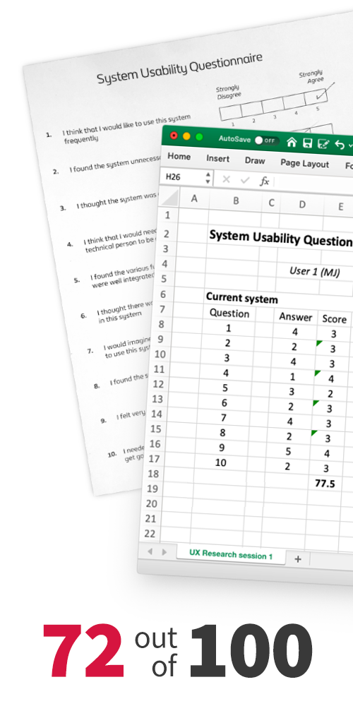
I also wanted to quantify the user feedback on the current app design. At the end of my interviews I’ve asked the users to assess the existing design of the website by completing a questionnaire that uses System Usability Scale (SUS).
SUS score
I’ve calculated the score using SUS calculator in Excel I’ve created using relevant formulas: 72 0ut 0f 100.
Rating the competition
I wanted to see what other popular apps in the same space were doing, where their strengths lay and where Find Me Gluten Free had the advantage. For the analysis I chose Gluten Dude and Glusearch. Both were more focused on locations in USA but still had information on locations in Ireland. Read the findings below or click on the list to see the full analysis.

Who else could be a user?
I was now starting to build a good picture of a Find Me Gluten Free user, but I needed more information. I wanted to further understand why someone who is not a current user may start using the app and what would be the most important aspects for them in a specialist restaurant finder app. This would help prove my hypotheses.
For this I decided to do a survey to reach a wider number of people about what aspects they would find most important in a gluten free restaurant finder app. I ran a single-answer survey among 20 representatives of the target audience using Google Forms see what they would use a gluten free restaurant finder app for most frequently..
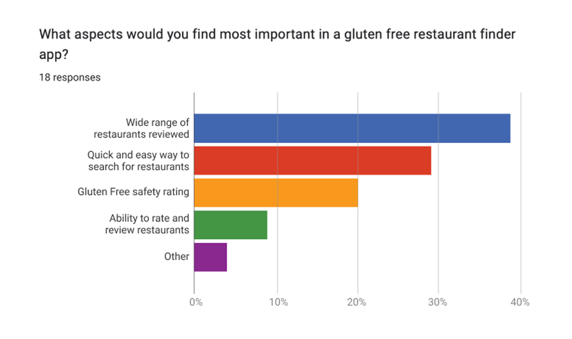
38.4% – wide range of restaurants reviewed, 28.8% – quick and easy way to search for restaurants, 19.9% – gluten free safety rating, 8.9% – ability to rate and review restaurants, 4.0% – Other

The user journey – walking in their shoes
Next I wanted to understand how many steps it takes for users to search for a good gluten free restaurant in their location. I also wanted to see the steps for reviewing a restaurant as well. These are the most popular user journeys. This may show if the user journeys could it could be improved or simplified. If they take too long, take too many steps or make users jump through too many needless hoops then they may drop out before completing the task and you lose their trust.
Current popular app user journeys
I’ve mapped using figjam a detailed flow of searching for a restaurants and other popular journeys.

Validating my design assumptions
Moving on in my journey, I did some usability testing to validate all of my design assumptions from the design review. I had identified some issues with the site to improve upon but needed validation from a third party to make sure I didn’t overlook anything
Find a restaurant and leave a review process walkthough
To achieve this I set up as face-to-face usability test. I chose a sample app user from the target audience and asked them to complete a set of tasks on the mobile website. I used Loom app for this as it was easy to install, set up and connect to my laptop to observe the person. I received some narrated video that provided lots of insights to test my hypotheses.
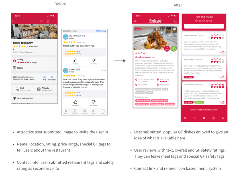
Based on what I learned, I proposed to keep all the useful info but make it easier to digest through the use of colour and consistent design. I believe we can trust the viewer more to explore the app and not push all the information in their face when creating the restaurant listing screens.
Was I on the right track?
Now I had to take all the information I gathered from the research and start putting some flesh on the bones of my hypotheses. I believed that keeping the valuable info on restaurants was important as this was the app’s greatest strength. The design needed to be changed to sort it better visually and make a more consistent visual hierarchy across the whole app.
This would be important to help users navigate the app, research and locate safe places to eat. Once they have built up trust and familiarity they would start to contribute, write reviews and explore the other functionality of the app. If they don’t feel comfortable finding places to eat and trustworthy information then they won’t look any further at what the app can do. Was I on the right track?
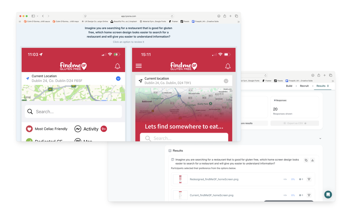
Home screen comparison test
To find out I decided to test how the current design and a proposed design for the home screen on mobile tested against each other with users. I set up an a/b test on both search page designs using Lyssna.com with each variant side-by-side.
Variant 2 has a 72% probability to be the best based on the number of preferences during the test. Comments stated that the search field was much clearer and easier to see, the little icons under the search field made it handy for quicker searches, the colourful tags for gluten free menus and items jumped out at people.
My hypothesis was proved correct so I could move on.
Redesigning the website
I finally had a road map and a vision to go with it and now it came to my favourite part – taking all that research, analysis and testing insight and putting it to work in the re-design process.

The design of the whole app was in scope I needed to polish the app to make it more usable and manage the information being shown to users. It’s currently all thrown on to the screen without giving enough care to how the user consumes and interprets it.
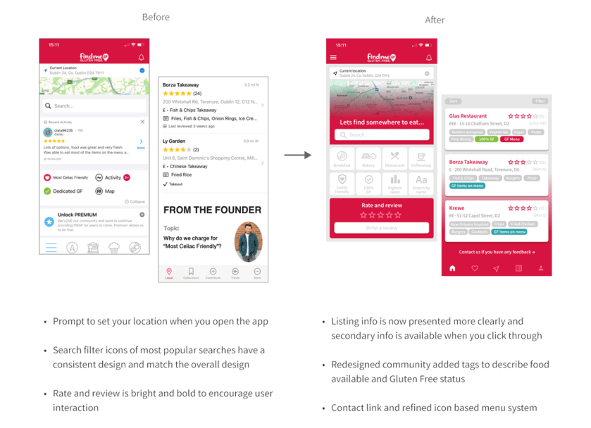
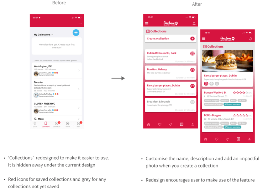
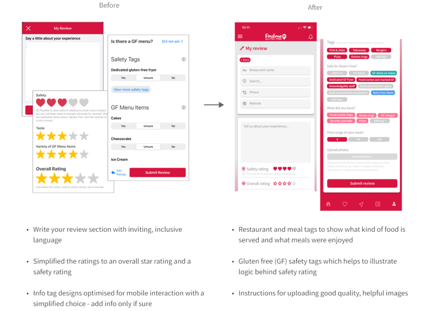
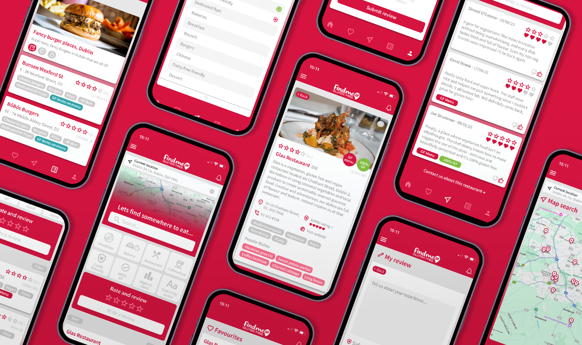
I started off by doing some simple wireframes. I looked at information displayed on the current pages and played around what was important to the user and what wasn’t necessarily helpful before moving to a high fidelity prototype.I introduced more icons to reduce the amount of text, especially on home screen. I balanced the use of the red brand colour with neutral white and greys. The red is reserved for important fields, data points and calls to action. I kept the functionality and information which is the point of difference for this app but restructured it, so it’s introduced in the right way. Introducing good quality imagery also helped guide the user and provide some nice contrast and make certain screens pop.
See my prototype in action or watch the video below.
You can see a step-by-step breakdown of the changes and the benefits of my re-designed and improved app below